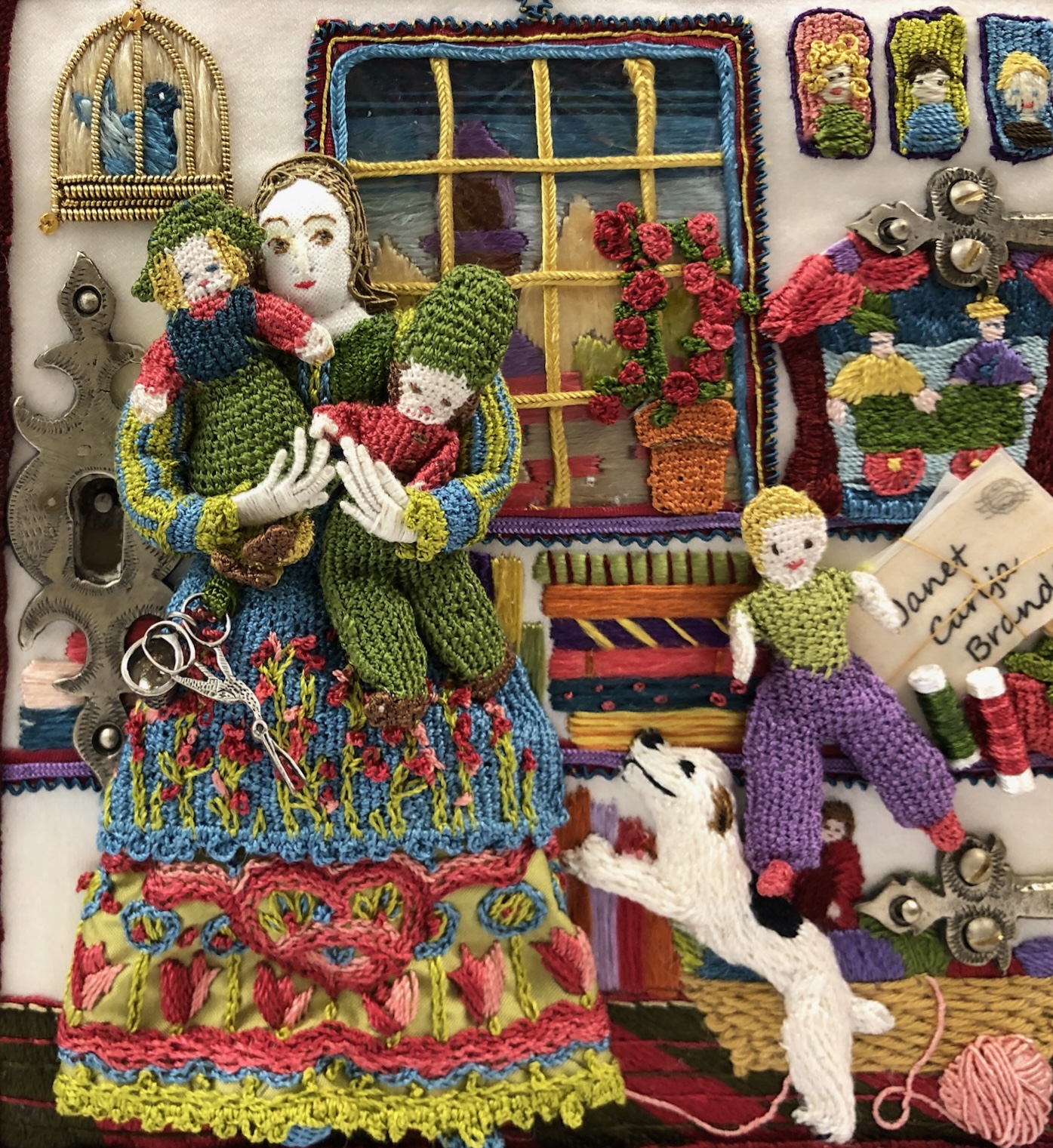
I loved the panel I embroidered on the deep red silk. I picked the red to carry over the red from the roof top on the casket front.
But I didn’t like how the colors worked together on the side. They ‘matched’ but they didn’t flow.
Using the same basic design but a different background I started over.
Much better.


I agree, Janet, there is no comparison. Most people would be very satisfied with the first one, but I guess you knew you had something better in you. And I am very inspired by your determination to stay true to your vision!
Thanks Monica. And just think of all the rejects I can frame separately!
The red is a beautiful color but your stitching did get lost. I agree that the lighter background is much better. Beautiful work!
Thanks Darlene. Lost is a good way to describe the red embroidery.
Altogether better, yes. Although the red is still stunning..
looks amazing